How Kaspersky’s new brand is engineered to bring on the future
Credit to Author: Nikita Morozov| Date: Thu, 18 Jul 2019 08:28:04 +0000

As you may already have noticed, we have a new look. A radical new haircut, if you will. We trimmed the “Lab” and are now just Kaspersky.
But the new look is more than just dropping a few letters and adding a fresh coat of paint. That’s just the start. Our new mission is: Building a safer world.
That’s all of our customers’ futures: families, individuals, and businesses of all types and sizes all over the world, from the Kuril Islands to Kathmandu.
And just like the first step in any big journey, it starts at home. Here’s our founder, Eugene Kaspersky, on the idea behind our new identity.
But this post isn’t just about the company’s direction. For typography nerds, interested in the very fine lines, and for more on how our brand is evolving, here’s the full story.
In the beginning was the word
Our current logo was developed way back in 1997, when the company was taking its first baby steps. The wordmark (Kaspersky’s name logo) used shapes from the Greek alphabet. The word “Lab” would often go unnoticed by the viewer, and it didn’t always make sense to the audience. Our customers have always just called us Kaspersky.
As the Internet gained popularity, it brought new formats. That’s a nice way to say that our logo, with its shapely font and red triangles, was tough to read on smaller screens.

Our old wordmark logo: 1997–2019 (RIP)
Our new look
Now, more than two decades later, we’re giving our wordmark a new look. Created in collaboration with Moving Brands, the wordmark uses geometric and mathematically exact letters and individual elements. An open, yet also secure. The letters a, p, and e symbolically connect our engineering past with our continued commitment to precision technology engineering.

Our new wordmark has engineering spirit in its DNA
Every detail of the wordmark has been carefully crafted for precision — we’re obsessed! Moving away from the symbolism for a minute, we removed the word “lab” because our work goes far beyond our original “antivirus laboratory” concept.
We’re really thrilled with the look — bold and fresh, but also clear, approachable, and readable (in all font sizes!).
Design for the digital age
The wordmark is our principal visual identifier, but for the age of the mobile app and the website favicon, we’ll use the letter K. Font-weighting fans, take note, we made this one a bit thicker to stand out better.

But branding’s not only about the logo, right? We want everything you experience from us to be distinctively Kaspersky, from t-shirts to an industrial cybersystem interface button. So we’ve designed our very own font, crafted in the same engineering style that you’ll see in all of our new communications. The font is called Kaspersky Sans. It’s adapted to use in large and small sizes, in Latin and Cyrillic alphabets.

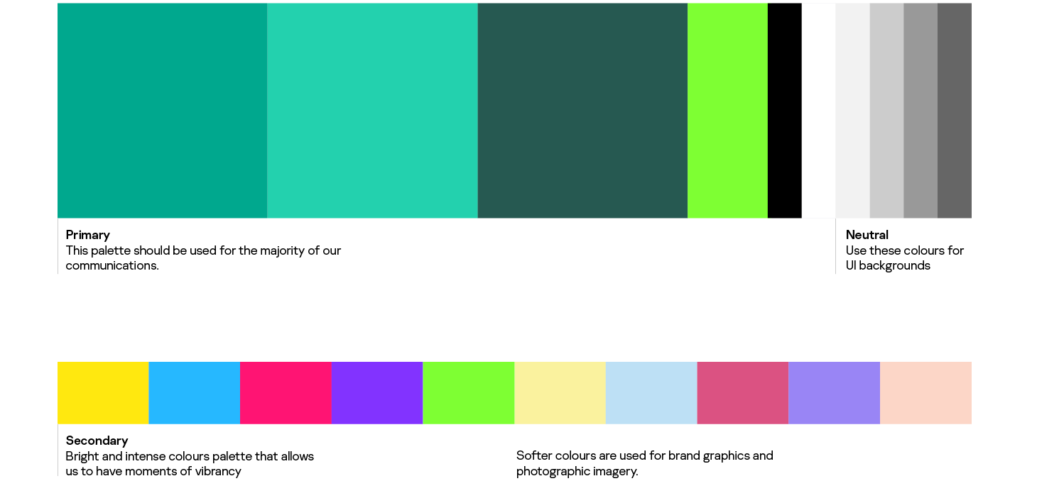
Bring on the color
From the start, our signature color has always been a dark teal green. It works wonderfully, distinguishing us from the competition. Today we’re adding a few more colors, adapted for digital content consumption on screens small and large, to vary the palette and to add energy to our communications.
Engineered for immunity
Kaspersky is known for our solutions’ unprecedented level of protection for people and businesses around the world. We’re proud of our security technologies. To tell this story, we visualized immunity using gradients and textures representative of the safe space Kaspersky provides.
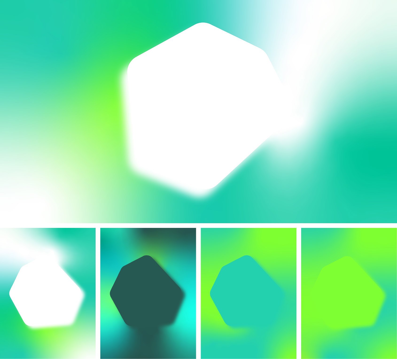
We created each image specifically for its theme and context, but they all share a recognizable visual language. The hexagon shape echoes the shape of our product icons — a link from our heritage to today.
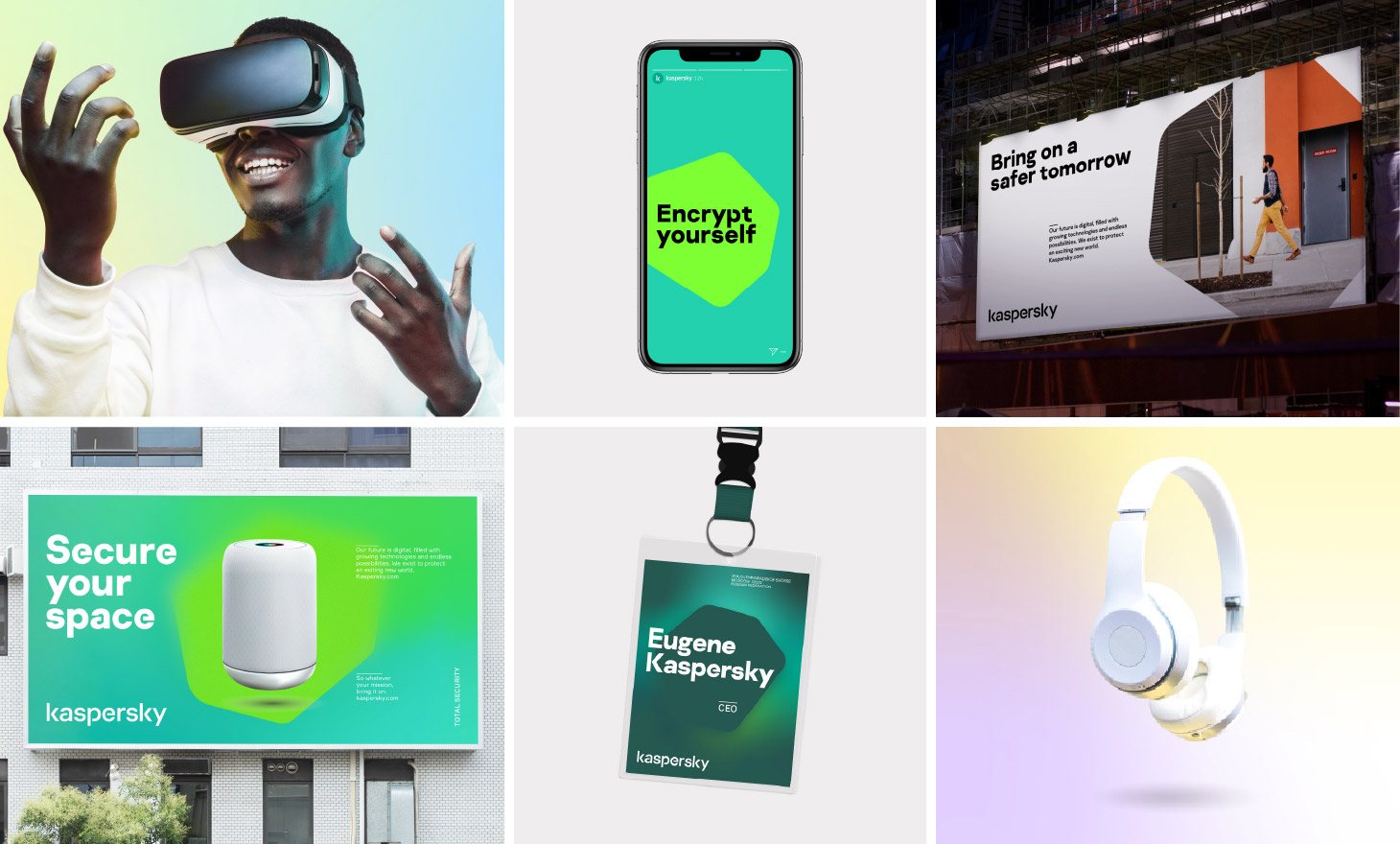
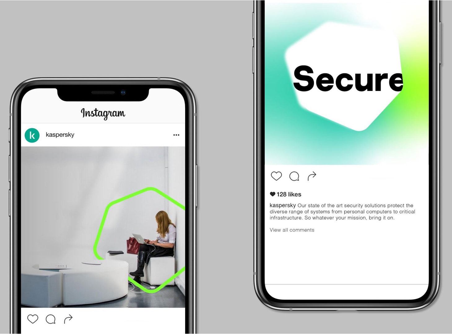
Combine the engineering and immunity layers and you get a design system that’s flexible, adapting to different messages and audiences, but in a consistent way. We’ve dropped our approach of using different visual identities for our consumer, small-to-medium business and enterprise audiences. Now you’ll always see and experience just one, unified Kaspersky.
Bring on the future
This new visual style is just the start of our rebranding. We’ll soon launch an updated mission of the refreshed brand to audiences around the world. We look forward to seeing how our marketing teams and creative partners will help to shape this and bring it to life.
Bring on the future!
We’d love to know what you think of the new look. You can contact Kaspersky’s brand team at brand@kaspersky.com.
